About DIKSHA
DIKSHA (Digital Infrastructure for Knowledge Sharing) is a national platform for school education, an initiative of National Council for Educational Research and Training (NCERT) under Ministry of Education. The platform provides digital textbooks, e-learning content, and professional development courses for students, teachers, and parents across multiple Indian languages.
The challenge
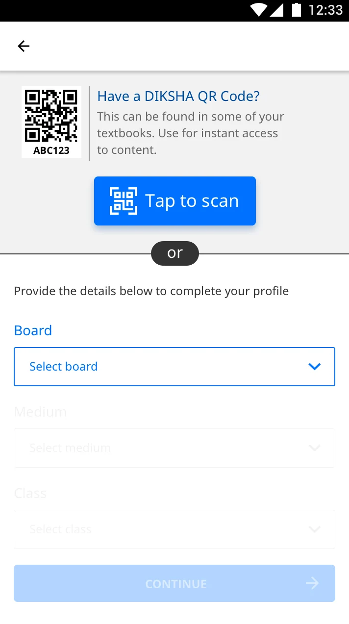
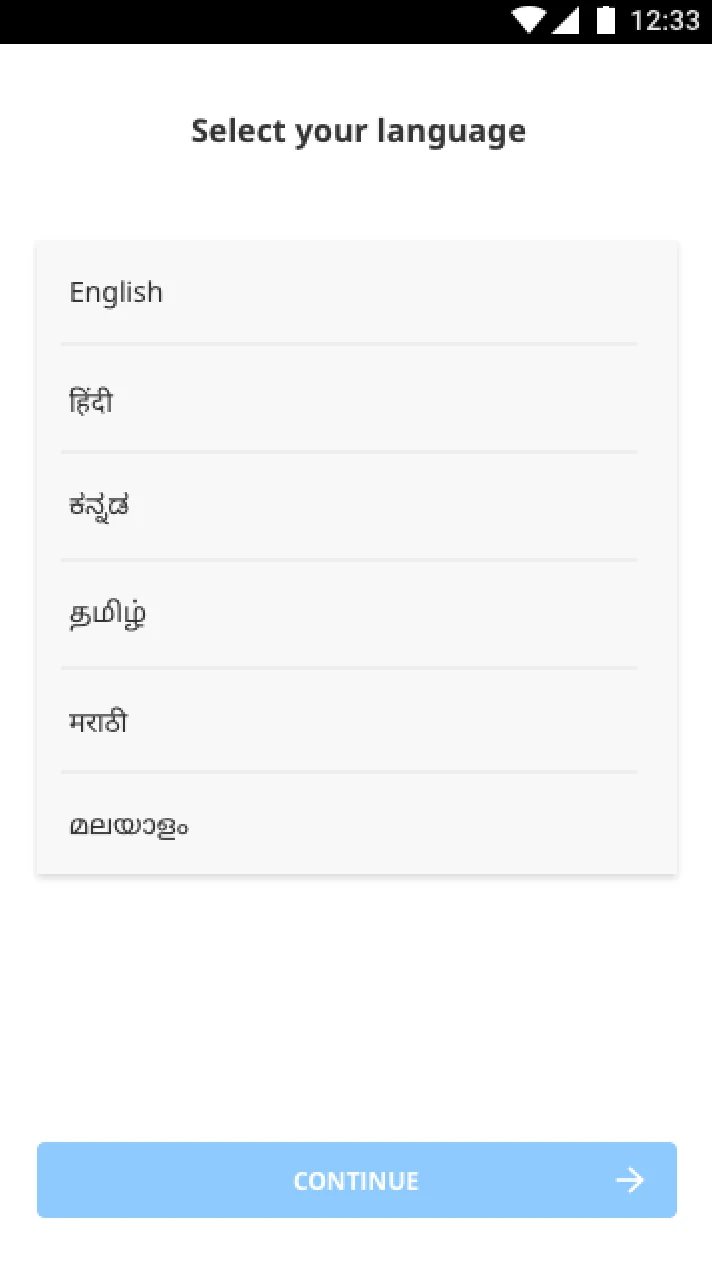
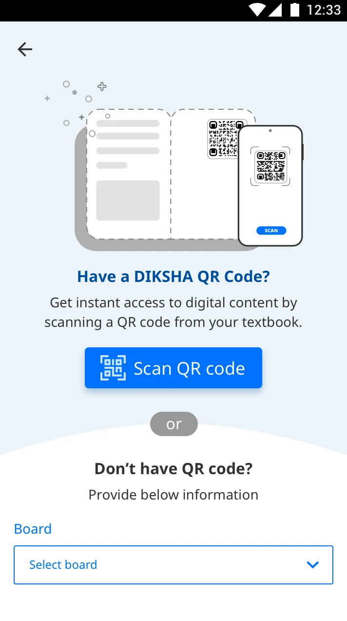
While user acquisition was strong with an average of 15–25K user installations per day, research revealed that many first-time users struggled to onboard, discover and engage with relevant learning content after installation.
Our priority was to improve the first-time user experience for all user personas, and improve discoverability of relevant content on the platform - thereby improving user activation.
How we approached it
Rather than treating this as a one-time redesign effort, we split the effort into phases. Phase 1 to solve the interaction & usability issues & Phase 2 to improve overall visual language & accessibility.
We adopted a rapid experimentation model to quickly build & validate our hypotheses. We chose to run weekly sprints where we start our week by building hypotheses, build, validate, iterate & launch by end of the week. We launch it to 50% of audience to observe usage over a period of time and only then release it to a wider audience if the solution performed well.
Mon
Hypothesize, design (UX)
Tue
Design (UI), development planning
Wed
UT, component creation
Thu
UT, changes, development
Fri
Develop, test, deploy
What we learned
Clear explanations reduce uncertainty during onboarding.
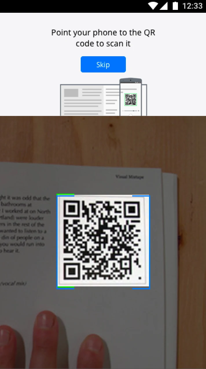
Users are more comfortable granting permissions when they understand why access is needed and what it enables.
Unexpected interactions can create anxiety and cause users to abandon the flow.
Introducing unfamiliar interfaces without enough context can disrupt confidence and lead to drop-off.
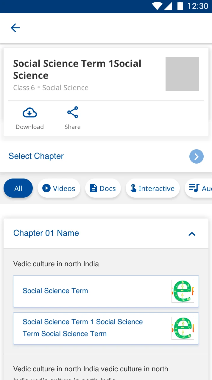
Content discovery needs to be obvious and task-oriented.
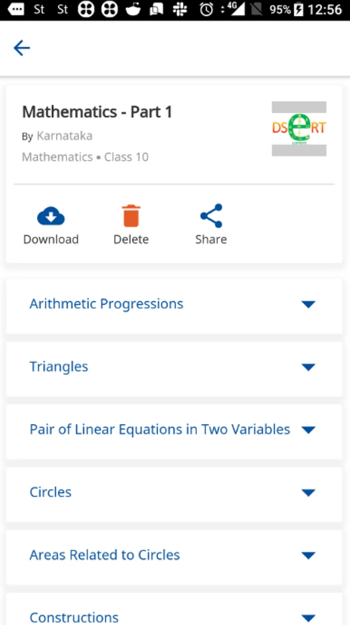
When users open a textbook, clear navigation and strong affordances help them quickly identify the content they are looking for.
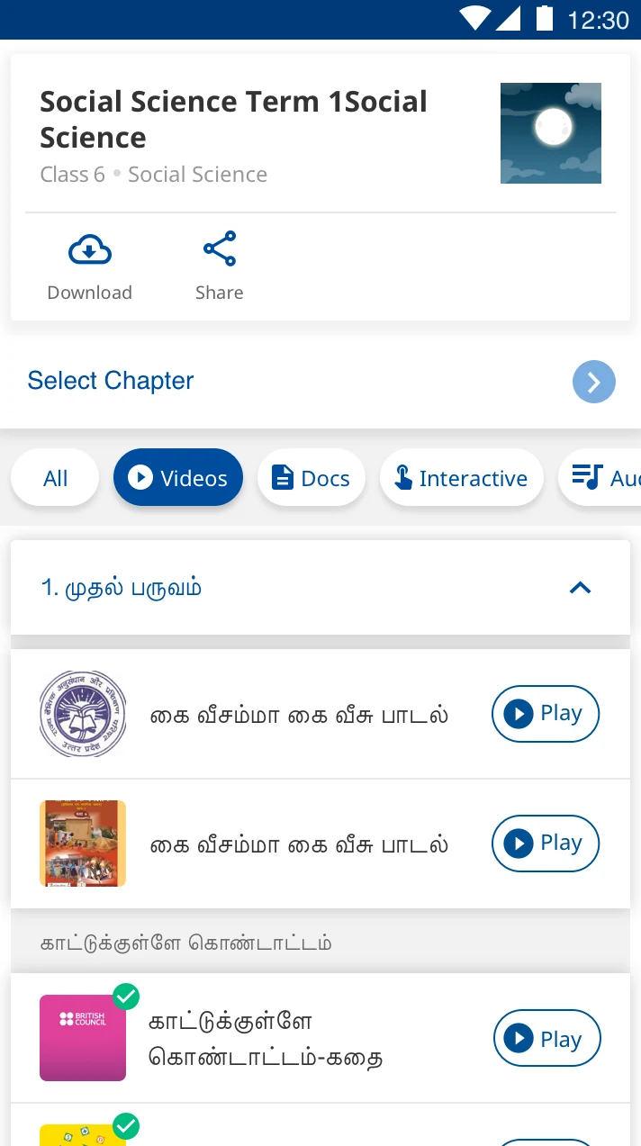
The primary action should be easy to spot.
Making “Play” more prominent and easier to find helped users move forward with less friction.
Curious to learn more about how we ran these experiments & what we observed & learned? I’d be happy to walk through the research, the trade-offs, and what we learned from improving activation on DIKSHA.